Boutique Training – Branding
the brief…
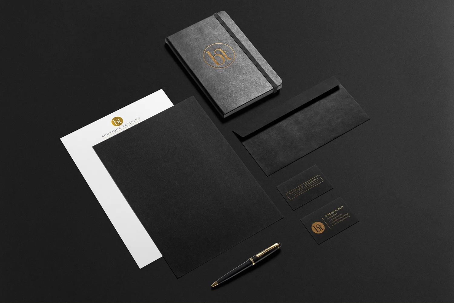
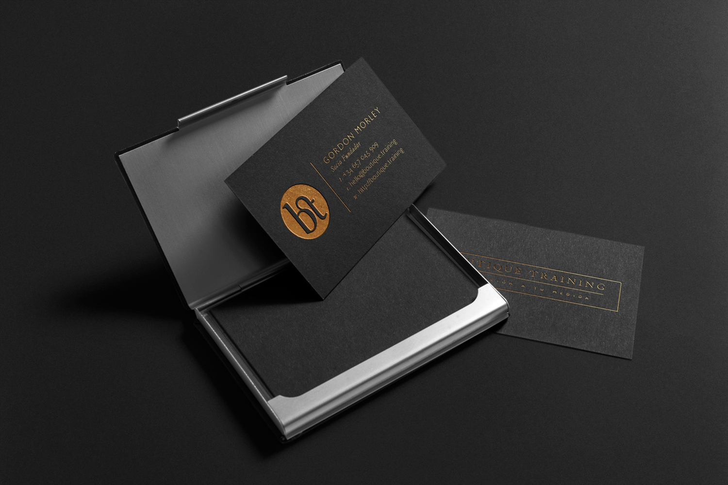
To create a brand identity for a new business venture teaching English as a foreign language in Madrid, looking to target large corporations and organisations. The image of the company was created to focus more on the high-end style to attract the correct type of client. The client specified gold and black as a colour scheme to fit with this and was advised foil blocking was the best way to achieve this in printed literature.
I used a typographic approach for the logo to give a classy and timeless look to the brand, and a ‘bt’ logotype plus a full logo were designed to help the brand retain its high-end appearance whilst giving its usage flexibility.


